
The Science of Mood
Understanding how colors interact with neural pathways to shape perception, influence behavior, and create emotional responses in designed environments.
Neurological Foundations
Color perception begins in the retina, where specialized cells called cones detect wavelengths of light. These signals travel through the optic nerve to the visual cortex, where the brain processes color information. Simultaneously, the hypothalamus and pituitary gland respond to color stimuli, influencing hormone production and emotional states.
Warm Spectrum
Warm colors like reds, oranges, and yellows stimulate the sympathetic nervous system, increasing heart rate and energy levels. They promote social interaction and appetite, making them effective for dining and gathering spaces.
Cool Spectrum
Cool colors such as blues and cyans activate the parasympathetic nervous system, promoting calmness and focus. They reduce perceived temperature and are associated with productivity and concentration.
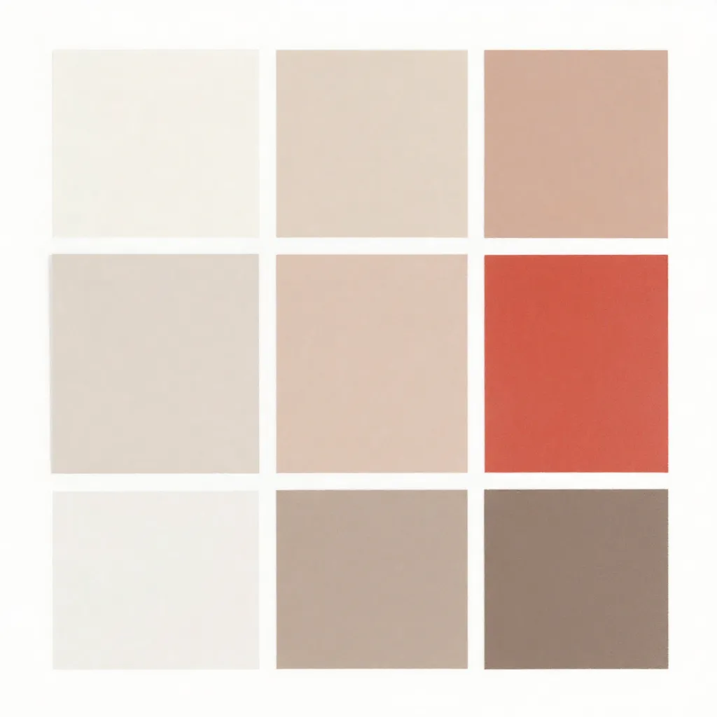
Neutral Spectrum
Neutral tones provide visual rest and allow other elements to take prominence. They create sophisticated backdrops that enhance rather than compete with functional and decorative elements.
Mood Selector Demonstration
Select a desired emotional outcome to see how color selection adapts to support that intention.
Select a mood above to see recommended color palettes
Practical Applications
Research in environmental psychology demonstrates that color choices significantly impact cognitive performance, emotional well-being, and social dynamics. Understanding these relationships enables intentional design decisions.
Workspace Optimization
Studies indicate that blue and green tones support sustained attention and reduce eye strain during extended work periods. Strategic use of warm accents can stimulate creativity in collaborative areas.
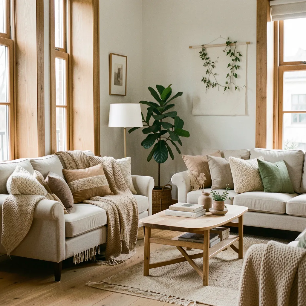
Residential Wellbeing
Bedroom environments benefit from cooler, muted tones that signal the brain to prepare for rest. Living areas can incorporate warmer hues to encourage social interaction and comfort.
Brand Communication
Color associations vary across cultures and contexts. A well-considered palette communicates brand values, differentiates from competitors, and creates memorable visual identities.
Color in Practice
Environmental Impact
Colors interact with natural and artificial lighting to create different visual experiences throughout the day. Understanding these interactions helps create consistent color experiences.
Cultural Context
Color meanings vary across cultures. A comprehensive consultation considers cultural associations to ensure colors communicate the intended message effectively.